SysAid allows you to include a variety of charts and graphs in your reports to present your data in a clear way. This page details how to create various charts to display your reporst in a way that most meets your needs.
For more information about the report form, see Report Form.
- Edit your report to include the list displayed in the Preview area.
- If you included the list, select if the chart should appear First (above the list) or Last (below) the list.
- Select a chart size: Small, Medium, or Large.
For information on building or editing your report, see Build Report.
List
This is the default report type. Each field is represented as column headers in the list of Reporting results.
To change a report from one a graphical format to list format
- In the top-right corner of the form, click
 .
. - In the Layout tab, click
 .
.
Pie Chart
Pie charts allow you to analyze a field by comparing the amount of times each value appears in relation to each other.
To build a pie chart report
- In the top-right corner of the form, click
 .
. - In the Layout tab, click
 .
. - From the Group By drop-down, select the field you want the pie chart to display.
- To add more fields to this drop-down, add them to the report's preview.
- Select if you want your report to include the list displayed in the Preview area.
- If you included the list, select if the chart should appear First (above the list) or Last (below) the list.
- Select a chart size: Small, Medium, or Large.
- If you want the chart to display only the top items, select the number of items from the Other Threshold drop-down.
For example, if you select 10, the chart displays the top 10 items only.- If you want to display all the other items in one slice entitled "Other", select the Show Other check box.
- To display the chart data, click the Chart Data check box.
Bar Chart
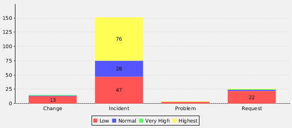
Bar charts offer another method for comparing field values. You can use the Stack feature to group the field values by another field.
To build a bar graph report
In the top-right corner of the form, click  .
.
- In the Layout tab, click
 .
. - From the Chart Group By drop-down select the field you want to display in the bar chart.
- To add more fields to this drop-down, add them to the report's preview.
- Select if you want your report to include the list displayed in the Preview area.
- If you included the list, select if the chart should appear First (above the list) or Last (below) the list.
- Select a chart size: Small, Medium, or Large.
- Select the vertical or horizontal arrows to determine the direction of the bars.
- If you want to group your bar chart by a secondary field, select the field from the Stack Field drop-down.
- Choose to display the secondary field to be displayed stacked in one bar or clustered in side-by-side bar by selecting the corresponding Bar Chart Type button:
 .
.
- Choose to display the secondary field to be displayed stacked in one bar or clustered in side-by-side bar by selecting the corresponding Bar Chart Type button:
- If you want the chart to display only the top items, select the number of items from the Other Threshold drop-down.
For example, if you select 10, the chart displays the top 10 items only.- If you want to display all the other items in one bar entitled "Other", select the Show Other check box.
- To display the chart data, click the Chart Data check box.

Line Chart
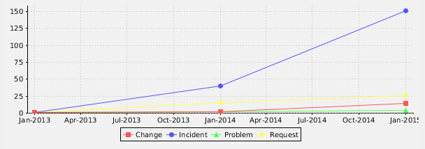
Line charts are effective for displaying trends over time. You can report on the frequency of an item over a time period you select.
To build a line chart report
- In the top-right corner of the form, click
 .
. - In the Layout tab, click
 .
. - From the Chart Group By drop-down select the field you want to display in the line chart. Each value for this field is represented by a different color line.
- To add more fields to this drop-down, add them to the report's preview.
- Select if you want your report to include the list displayed in the Preview area.
- If you included the list, select if the chart should appear First (above the list) or Last (below the list).
- Select a chart size: Small, Medium, or Large.
- From the Aggregated By drop-down, select the field you want represented numerically on the Y Axis.
- To add more numeric fields to this drop-down, add them to the report's preview.
- In the Aggregation drop-down, select if you want the count, average, or sum of the field's values displayed on the Y Axis. For example, if you select to display the Assigned Counter field you can display the amount of SRs that were assigned, the amount of times SRs were assigned or reassigned, or the average amount of times SRs were assigned or reassigned.
- From the the Trend drop-down, select the date field that marks time intervals on your graph. This is represented by dates on the X Axis.
- To add more date fields to this drop-down, add them to the report's preview.
- From the Trend Per drop-down select a time interval to mark. For example, if you select Month, the chart displays the number of items per month in the X Axis.
- If you want the chart to display only the top items, select the number of items from the Other Threshold drop-down.
For example, if you select 10, the chart displays the top 10 items only.- If you want to display all the other items in one bar entitled "Other", select the Show Other check box.

- If you want to display all the other items in one bar entitled "Other", select the Show Other check box.
Matrix
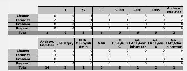
Matrix tables allow you to display the overlap between the values of two fields. For example, you can display how many of each service record type was requested by each request user.
To build a Matrix report
In the top-right corner of the form, click  .
.
- In the Layout tab, click
 .
. - In the Row and Column drop-downs select the fields you want to display in your matrix.
- To add more fields to these drop-down, add them to the report's preview.
- Select if you want your report to include the list displayed in the Preview area.
- If you included the list, select if the chart should appear First (above the list) or Last (below) the list.

- If you included the list, select if the chart should appear First (above the list) or Last (below) the list.