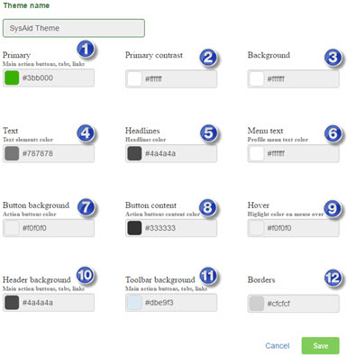
This page guides you how to select the theme colors to get the look you want for your Self-Service Portal.
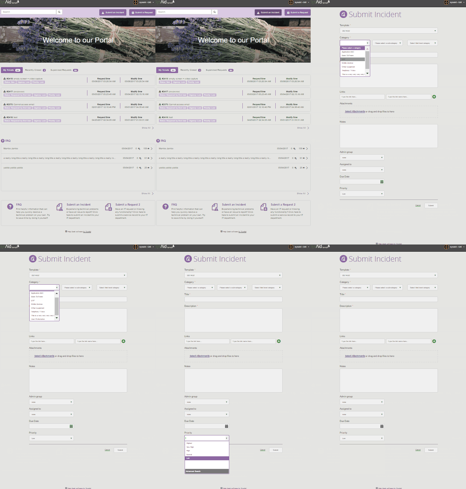
This theme configuration results in the Self-Service Portal colors that appear in the images displayed below.
Default SysAid theme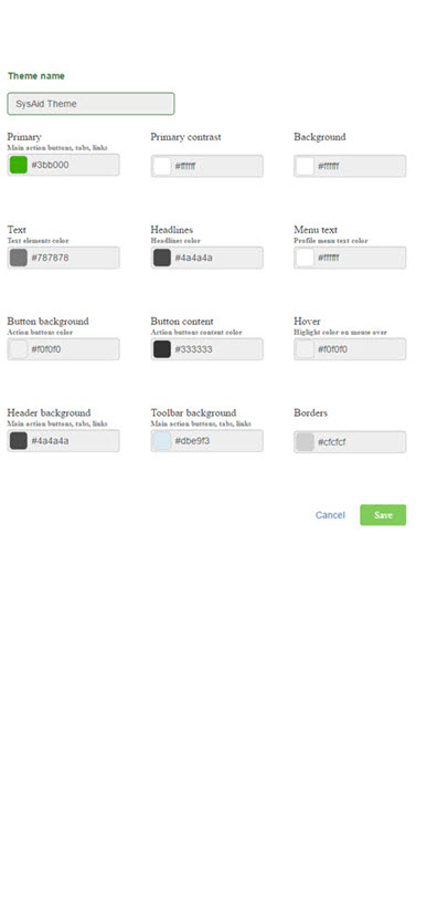
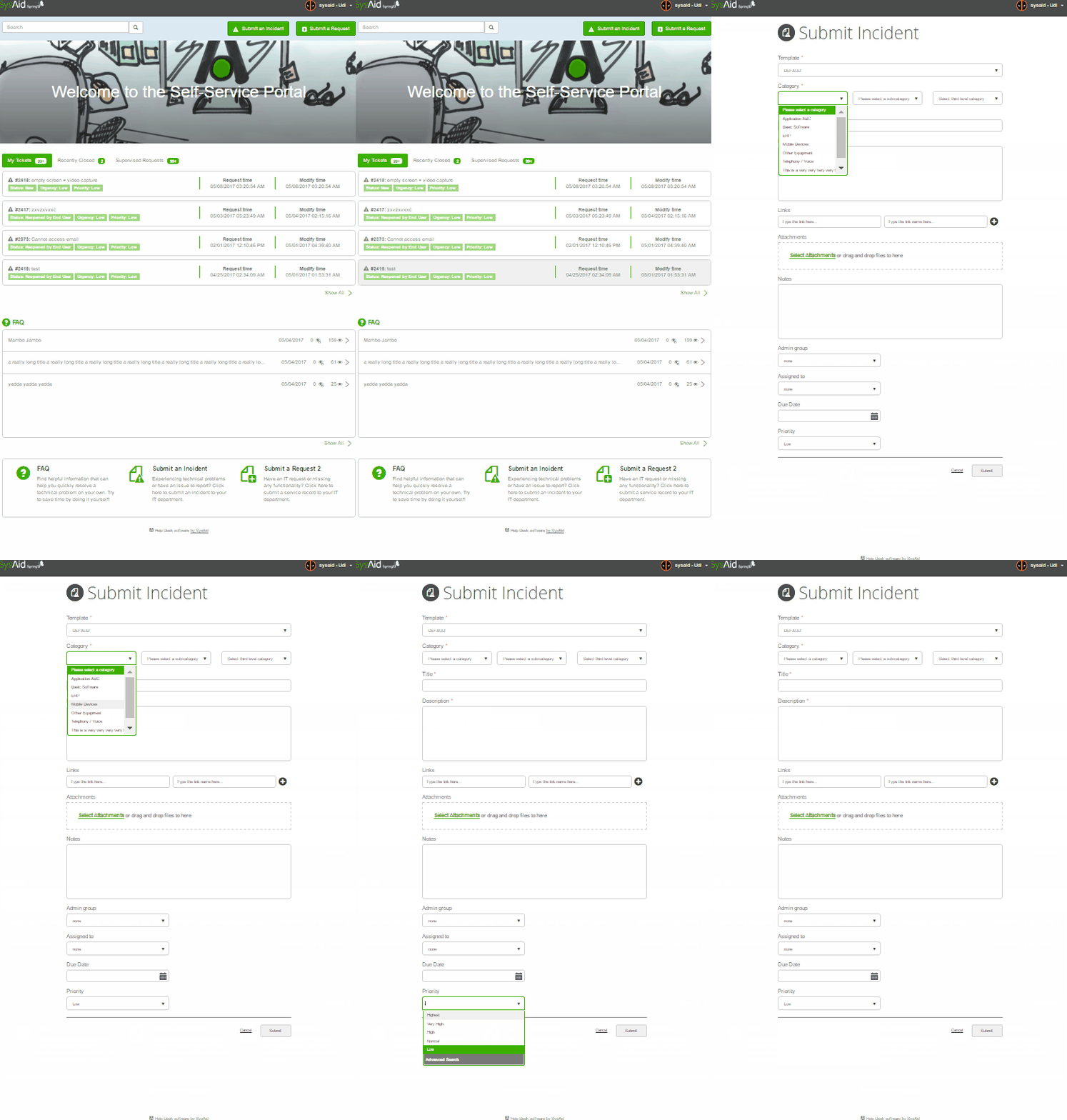
Custom theme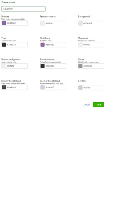
Theme objects
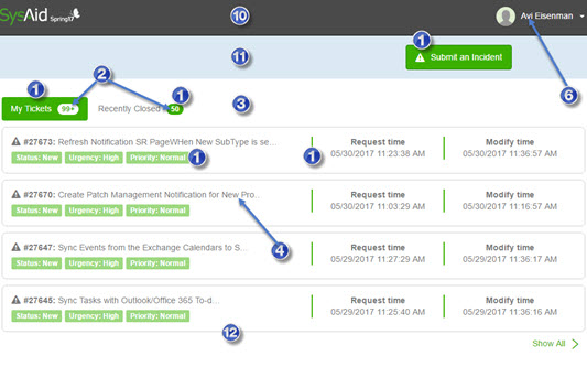
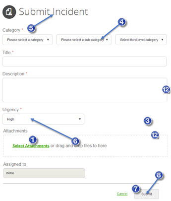
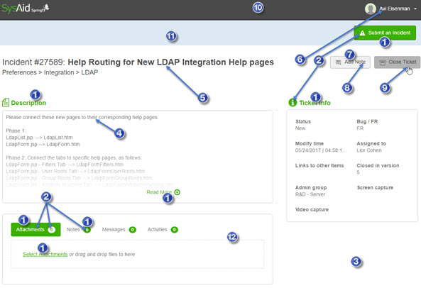
Primary

The Primary element affects the following UI objects:
Main buttons:

Active tab background:
Indicator background:

Fields displayed in list:

Dividers:

Link text:

Headings:
Toolbox Item icon:
![]()
Primary contrast

The Primary Contrast element affects elements that display the primary color as the text or the background. For examples, see the white text and backgrounds in the Primary section above.
Background

The Background element affects the main background for all pages in the Self-Service Portal. For examples, see the white backgrounds in the screenshots on the top of this page.
Text

The Text element affects the most of the text items in the Self-Service Portal.
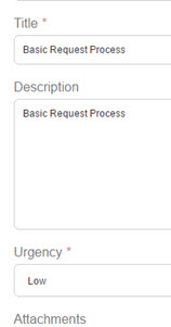
Headlines

The Headlines element affects the following UI objects:
Page headlines: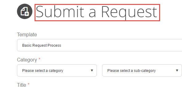
Toolbox Item headlines:
SR headlines: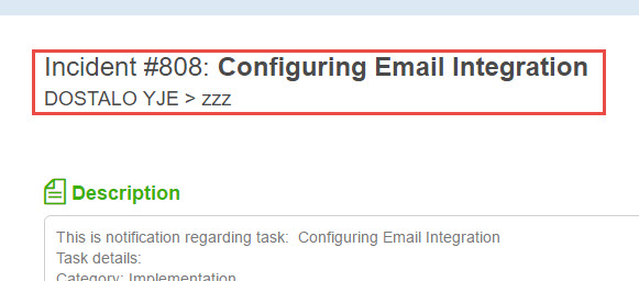
Menu text

The Menu Text element affects the following UI objects:
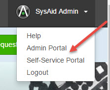
Text color for profile name:

Background color for main menu:
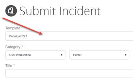
Background color fields in the SR submission form:
Button background

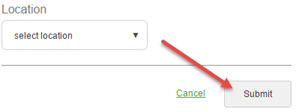
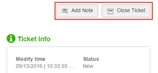
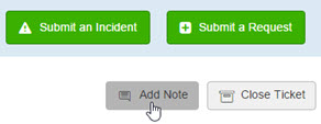
The Button Background element affects the background color of action buttons such as those below:
Button content

The Button Content element affects thetext color for action buttons such as the ones displayed above.
Hover

The Header Background element affects the objects that change color when you hover your mouse over them.
Header background

The Header Background element affects the header on the top of every page in the Self-Service Portal.

Toolbar background

The Toolbar Background element affects the background of the toolbar underneath the heading. See the image in the Header background section above.
Borders

The Borders element affects the borders of all fields and areas.
